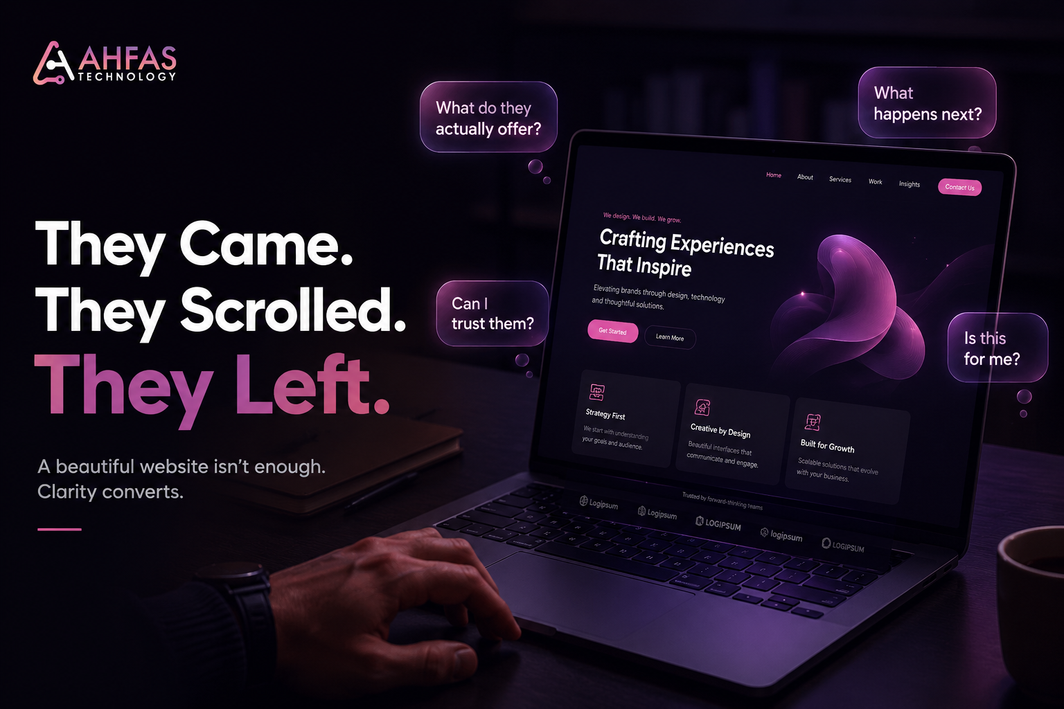
Traffic is coming.
Calls are not.
People visit, scroll, maybe even like the design, then leave without contacting you.
That is the real problem when your website looks good but not converting. The design may look polished, but visitors are not getting enough clarity, trust, relevance, or confidence to take action.
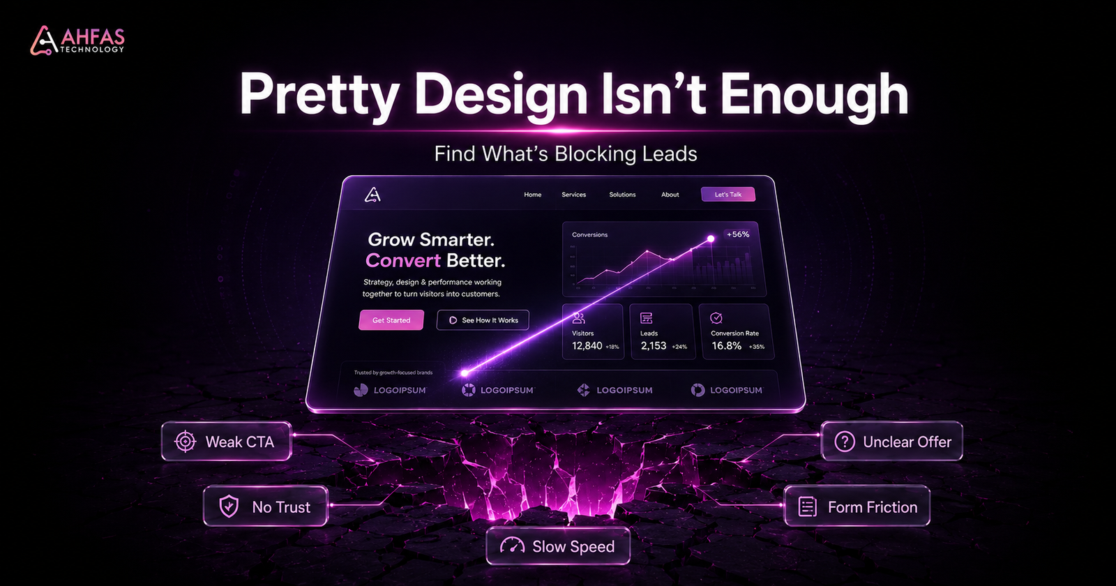
Your website does not convert because good visuals alone do not remove doubt. Visitors leave when the message is unclear, the CTA feels weak, the page loads slowly, the form asks too much, the offer sounds generic, or the website does not answer buyer questions fast enough.
Google’s guide on creating helpful, reliable, people-first content explains that content should be created to help people, not just to attract search traffic. The same rule applies to your website: it should help visitors understand, trust, and act.
The Real Problem
Most business owners judge a website by how it looks.
Visitors judge it by how quickly it helps them decide.
That is the gap.
Your website may have:
- A Clean Layout
- Professional Colors
- Modern Sections
- Good Images
- Smooth Animations
- A Presentable Homepage
But if visitors still do not call, submit a form, send a WhatsApp message, request a quote, book a consultation, or buy, the website is not doing its real job.
A good-looking website gets attention.
A conversion-focused website turns attention into action.
For many Karachi and Pakistan-based businesses, the issue is not that the website looks bad. The issue is that the website does not explain the offer clearly enough, build trust fast enough, or guide the visitor toward the next step.
AHFAS Technology helps businesses fix this wider digital gap through connected digital marketing services that combine website development, SEO, content, branding, design, and strategy.
Fresh 2026 Search and Conversion Reality
Search behavior is changing. People compare faster, skim more, and expect clearer answers before they contact a business.
Google’s official guide on optimizing for generative AI features in Search says that traditional SEO best practices still matter for generative AI features like AI Overviews and AI Mode. Google also highlights technical clarity, valuable non-commodity content, local business details, ecommerce details, and crawlable pages.
A 2026 empirical study on Google Search, Gemini, and AI Overviews found that AI Overviews appeared for 51.5% of representative real-user queries in its dataset. Another 2026 measurement study found that AI Overviews appeared for 13.7% of trending queries overall and 64.7% of question-form queries.
This matters because users now get summarized answers faster. If your website is vague, thin, slow, or unclear, both people and search systems may struggle to understand why your business deserves attention.
Your website must make three things obvious:
- what you offer
- why visitors should trust you
- what they should do next
Key Takeaways
- A beautiful website can still fail if the message, CTA, proof, and user journey are weak.
- Good design makes the website look professional. Conversion-focused design helps visitors take action.
- Visitors leave when they feel confused, unconvinced, delayed, distracted, or unsure.
- More traffic will not fix a weak conversion path.
- The best first step is diagnosis, not a random redesign.
Who This Guide Is For
This guide is for business owners, startup founders, marketers, ecommerce brands, clinics, real estate companies, restaurants, education businesses, agencies, consultants, and local service providers whose websites look good but do not generate enough leads.
It is especially useful if you are thinking:
- My website gets traffic but no leads.
- Visitors come but do not contact us.
- Our website looks professional, but sales are weak.
- Our service pages do not convert.
- Our landing page gets clicks but no inquiries.
- We are spending on SEO or ads, but the website is not producing business.
If that sounds familiar, do not start by making the website prettier. Start by finding where trust, clarity, or action is breaking.
What Does “Website Looks Good But Not Converting” Mean?
It means your website creates a good first visual impression but fails to turn visitors into leads, calls, bookings, inquiries, or sales.
A conversion can be:
- A Phone Call
- A Whatsapp Message
- A Contact Form Submission
- A Booking
- A Quote Request
- A Product Purchase
- A Consultation Request
- An Email Inquiry
- A Checkout Completion
If people visit your site but do not act, your website has a conversion problem.
The issue may be design. But more often, the real issue is unclear messaging, weak trust signals, poor user journey, slow speed, low traffic intent, confusing CTAs, or missing conversion tracking.
Good Design vs Conversion-Focused Design
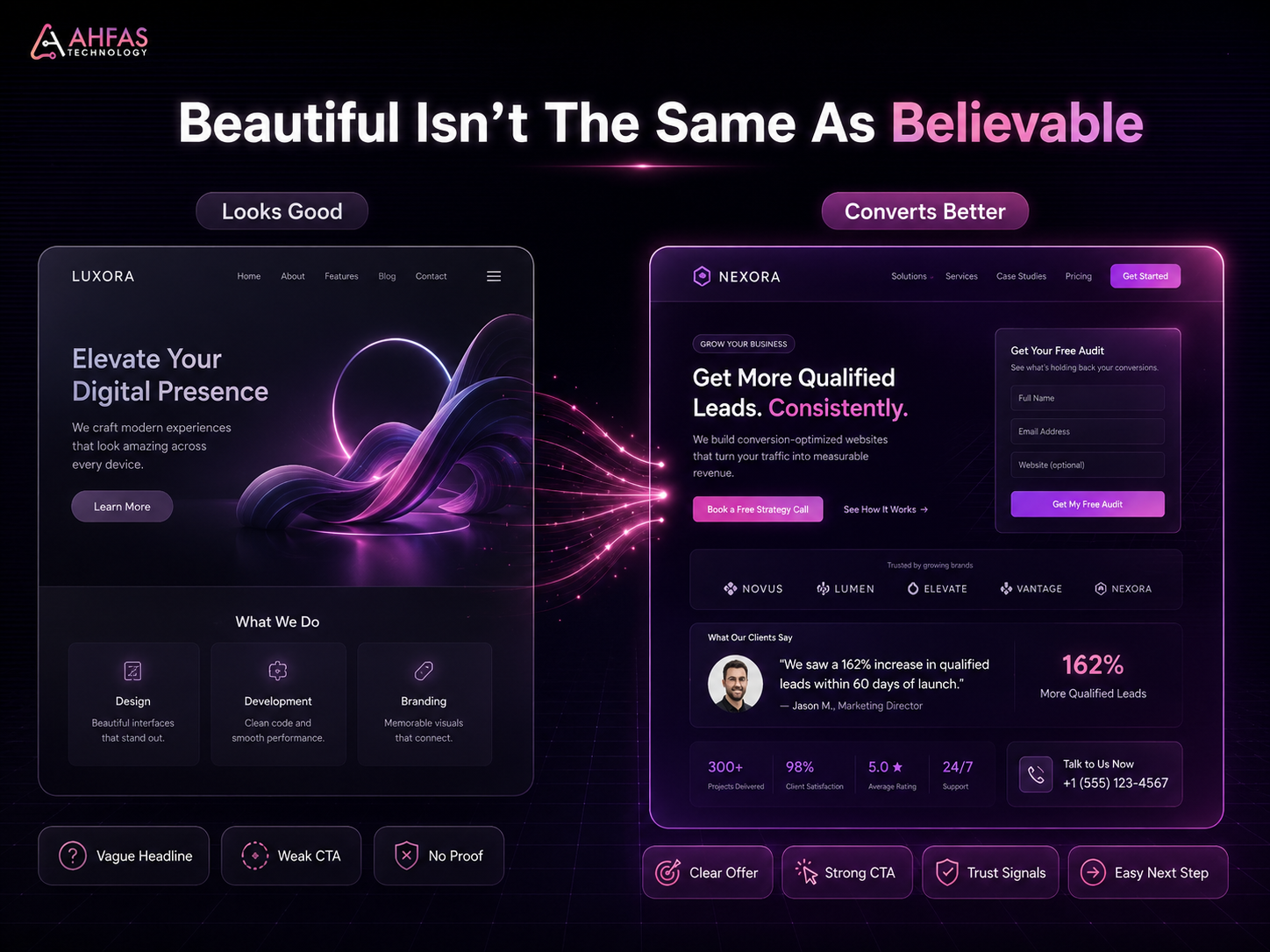
Good design makes your website look presentable. Conversion-focused design helps visitors decide.
| Good-Looking Website | Conversion-Focused Website |
| Looks modern | Makes the offer clear |
| Uses nice colors and visuals | Guides visitors toward action |
| Shows services | Explains why those services matter |
| Has a contact button | Makes the next step obvious |
| Feels polished | Builds trust before asking for action |
| Focuses on appearance | Focuses on user decisions |
| May impress your team | Helps generate measurable inquiries |
Nielsen Norman Group explains that user experience covers all aspects of the user’s interaction with a company, its services, and its products. That is why conversion is not only about the website layout. It is about the full decision journey.
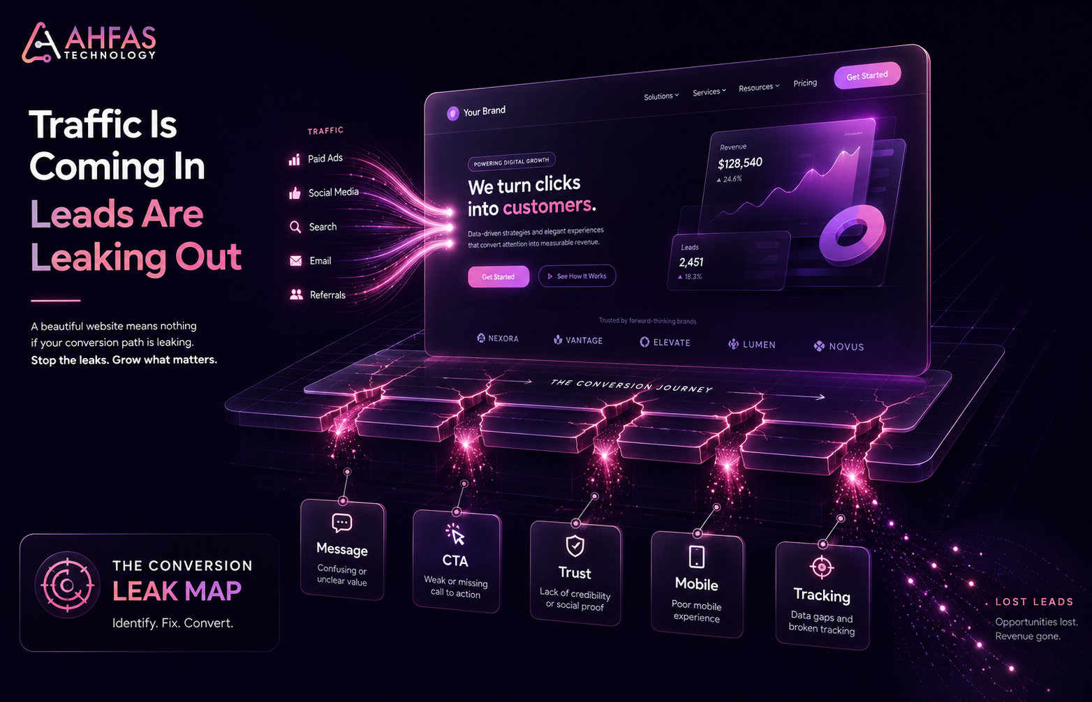
How to Check If Your Website Has a Conversion Problem
Start with behavior, not opinions.
A website conversion problem becomes clear when people visit but do not act.
| What You See | What It May Mean | What to Check First |
| Traffic but no leads | Offer or CTA is unclear | Above-the-fold message |
| High bounce rate | Visitors do not see relevance fast | Headline, speed, page intent |
| Clicks but no form submissions | Form may feel too long or risky | Form fields and trust signals |
| Mobile traffic but no calls | Mobile CTA may be weak | Tap targets, WhatsApp, phone CTA |
| Service page views but no inquiries | Page does not answer buyer questions | Copy, proof, process, FAQs |
| Add to cart but no purchase | Checkout friction | Shipping, payment, return policy |
| Users scroll but do not click | CTA is weak or poorly placed | CTA wording and placement |
Use Google Analytics 4, Google Tag Manager, Google Search Console, PageSpeed Insights, Lighthouse, Microsoft Clarity, Hotjar, or VWO to see where users hesitate, drop off, or leave.
The Trust Before Traffic Framework
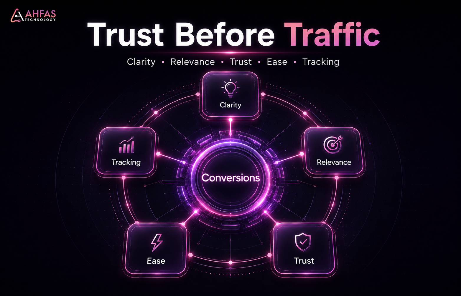
Before spending more on ads, SEO, or a redesign, check these five areas.
1. Clarity
Can visitors understand what you do within five seconds?
2. Relevance
Does the page match what the visitor expected when they clicked?
3. Trust
Does the page prove that your business is real, capable, and safe to contact?
4. Ease
Is the next step simple on mobile and desktop?
5. Tracking
Can you measure forms, calls, WhatsApp clicks, bookings, purchases, and quote requests?
If any of these five areas is weak, your website can look good and still fail.
15 Reasons Visitors Leave Without Converting
1. Your Message Is Not Clear Above the Fold
Visitors should not have to guess what you do.
The top section of your page should quickly explain:
- what you offer
- who you help
- what problem you solve
- why it matters
- what the visitor should do next
Weak version:
“We create digital solutions for modern businesses.”
Stronger version:
“Get a clear, fast, conversion-focused website that helps visitors understand your services and contact you with confidence.”
The first sounds polished. The second explains value.
2. Your Website Talks About You, Not the Customer
Many websites say:
- We are creative.
- We are passionate.
- We deliver quality.
- We provide complete solutions.
Visitors are thinking:
- Can you solve my problem?
- Have you worked with businesses like mine?
- What will I get?
- How much effort is required?
- Why should I trust you?
- What happens after I contact you?
If your website copy focuses only on your company, visitors may leave because they do not see their own problem reflected.
Strong copy connects your service to the customer’s real decision.
AHFAS supports businesses with content strategy help so website copy, service pages, and blogs explain value clearly instead of sounding generic.
3. Your CTA Is Weak, Hidden, or Too Vague
A weak CTA can quietly kill conversions.
Weak CTAs often include:
- Submit
- Learn More
- Click Here
- Send
- Get Started
These are not always wrong, but they often fail because they do not explain what happens next.
Better CTAs are clearer:
- Request a Digital Gap Review
- Book a Website Review
- Get a Service Recommendation
- Ask for a Quote
- Talk to AHFAS Technology
- Check What Is Blocking Leads
Your CTA should reduce hesitation. If the next step feels vague, visitors delay action or leave.
4. Your Website Lacks Trust Signals
People do not contact a business just because the website looks good. They contact when the website reduces doubt.
Trust signals include:
- reviews
- testimonials
- portfolio
- client examples
- business address
- phone number
- team information
- service process
- certifications
- case studies
- secure forms
- privacy policy
- clear pricing guidance
- real photos where useful
Google’s Search Quality Rater Guidelines discuss E-E-A-T and place strong emphasis on trust. For business websites, trust is not decoration. It is part of conversion.
5. Your Service Pages Do Not Answer Buyer Questions
A service page should do more than list services.
It should answer buyer questions before the visitor has to ask:
- What exactly is included?
- Who is this service for?
- What problem does it solve?
- What is your process?
- How long does it usually take?
- What affects cost?
- What makes your approach different?
- What proof do you have?
- What should I do next?
If your service page only says “We provide professional services,” it may look clean but still fail.
AHFAS offers website development support for businesses that need better structure, clearer user flow, and stronger page experience.
6. Your Traffic Is Not Buyer-Ready
Sometimes the website is not the only problem. The traffic may be wrong.
For example:
- Social media traffic may be curious but not ready to buy.
- Blog traffic may be informational, not transactional.
- Paid traffic may target broad keywords.
- SEO traffic may land on the wrong page.
- Local visitors may need location proof before contacting.
If traffic intent is weak, conversions will be weak.
That is why SEO, content, ads, and landing pages must work together. AHFAS provides professional SEO support to connect search visibility with business intent, not just keyword positions.
7. Your Mobile Experience Creates Friction
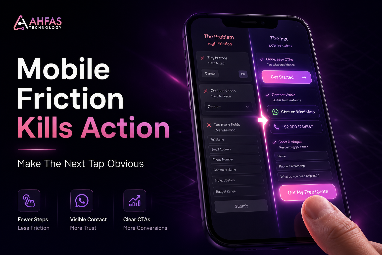
Many users visit websites from mobile. If your mobile experience is poor, conversions drop.
Mobile friction includes:
- Tiny Buttons
- Hard-To-Read Text
- Slow Loading
- Hidden Contact Buttons
- Long Forms
- Popups Blocking Content
- Whatsapp Cta Not Visible
- Phone Number Not Clickable
- Confusing Menu Structure
A website can look excellent on desktop and still fail on mobile.
Test your site like a real customer. Open it on mobile, find a service, read the offer, tap the CTA, and try to submit the form.
8. Your Forms Ask for Too Much
Long forms create hesitation.
Visitors may leave if the form asks for too much too early, such as:
- full address
- company size
- long project details
- budget before trust is built
- unnecessary dropdowns
- too many required fields
For a first inquiry, keep forms simple.
Ask only what you need to continue the conversation.
For many local service businesses, name, phone number, service need, and message are enough to start.
9. Your Page Speed Is Hurting Trust
Slow websites do not only hurt technical performance. They hurt trust.
When a website loads slowly, visitors may assume the business is outdated, careless, or unreliable.
Speed issues often come from:
- heavy images
- too many plugins
- poor hosting
- unused scripts
- large sliders
- unoptimized videos
- weak mobile performance
Use PageSpeed Insights and Lighthouse to test speed and user experience. Fix the biggest mobile issues first because mobile visitors usually have less patience.
10. Your Visual Design Distracts From the Message
Creative design can help a brand stand out, but too much visual noise can hurt conversions.
Common problems include:
- too many animations
- oversized images
- weak contrast
- unclear hierarchy
- decorative sections with no purpose
- too many colors
- text hidden inside visuals
- design elements competing with the CTA
Good conversion design is not boring. It is focused.
Every section should help the visitor understand, trust, compare, or act.
11. Your Website Has No Clear User Journey
A website should guide users from problem to solution.
A strong journey looks like this:
Problem awareness → service understanding → proof → process → CTA → contact
A weak journey looks like this:
Homepage → random services → generic paragraphs → hidden contact button
If visitors do not know where to go next, they leave.
AHFAS builds connected digital marketing services that help businesses become easier to find, understand, compare, and contact.
12. Your Offer Is Too Generic
A generic offer makes visitors compare you only on price.
Weak offer:
“We provide website design services.”
Stronger offer:
“We build clear, fast, conversion-focused websites for service businesses that need more inquiries, better trust, and a smoother contact journey.”
Your offer should clarify:
- who it is for
- what problem it solves
- what outcome it supports
- why your approach is different
- what action the visitor should take
If your offer sounds like every competitor, visitors have no strong reason to choose you.
13. You Are Missing Objection Handling
Visitors often leave because their doubts are not answered.
Common objections include:
- Will this fit my budget?
- Can I trust this company?
- How long will it take?
- What happens after I contact them?
- Do they understand my industry?
- Will I be pressured into buying?
- Can they solve my specific problem?
Your website should answer these doubts before the visitor has to ask.
Use FAQs, process sections, examples, proof, service details, and clear CTAs.
14. Your Analytics Are Not Tracking Real Conversions
Many businesses think their website is not converting, but they are not tracking properly.
You should track:
- Form Submissions
- Phone Clicks
- Whatsapp Clicks
- Email Clicks
- Booking Clicks
- Checkout Completions
- Quote Requests
- Important Button Clicks
- Thank-You Page Visits
Without conversion tracking, you are guessing.
Google Analytics 4 and Google Tag Manager can help track meaningful actions, not just traffic.
15. You Need Optimization, Not Just a Redesign
A full redesign is not always the answer.
Sometimes the website needs:
- A Better Headline
- Clearer Cta Wording
- Stronger Proof
- Faster Loading
- Simpler Forms
- Better Mobile Layout
- Improved Service Page Copy
- Stronger Internal Links
- Better Offer Clarity
- Proper Conversion Tracking
Other times, a redesign is needed because the structure, UX, brand perception, or technical setup is too weak.
The right decision depends on diagnosis.
CRO vs Redesign: What Do You Actually Need?
You do not always need a new website. Sometimes you need to fix the conversion path.
| Situation | Better First Step |
| Website looks fine but leads are low | CRO audit |
| Visitors do not understand the offer | Copy and messaging fix |
| Mobile experience is poor | UX and mobile optimization |
| Website is slow or outdated | Technical improvement or redesign |
| Service pages are generic | Service page copywriting |
| Traffic is low quality | SEO or ad targeting review |
| Brand feels untrustworthy | Branding and trust signal improvement |
| Forms are not submitted | Form and CTA optimization |
| Whole site feels confusing | Website journey redesign |
A redesign should not be based on boredom. It should be based on performance, clarity, trust, and user behavior.
What Most Businesses Get Wrong
Most businesses judge the website by design. Visitors judge it by confidence.
| Wrong Assumption | Reality |
| A beautiful website should convert | Beauty helps, but clarity converts |
| More traffic will fix the issue | Bad pages waste more traffic |
| A redesign always solves conversion problems | Sometimes copy, CTA, or trust is the real issue |
| Users read everything | Most users scan first |
| A contact form is enough | The page must build confidence first |
| People understand what we do | Clear messaging must prove it |
| We need more ads | You may need a better landing page first |
Your website may not need more visitors first. It may need a better reason for visitors to act.
What to Fix First
Use this priority order.
If Visitors Leave Quickly
Fix:
- headline clarity
- page speed
- above-the-fold relevance
- mobile layout
- visual hierarchy
If People Scroll but Do Not Click
Fix:
- CTA wording
- CTA placement
- offer clarity
- trust signals
- section flow
If People Click but Do Not Submit Forms
Fix:
- form length
- required fields
- privacy reassurance
- contact options
- form placement
If Service Pages Get Traffic but No Leads
Fix:
- service details
- buyer questions
- proof
- process
- FAQs
- CTA clarity
If Ecommerce Users Abandon Checkout
Fix:
- shipping clarity
- return policy
- payment trust
- checkout steps
- guest checkout
- mobile checkout
Baymard Institute has researched ecommerce UX and checkout usability for more than 14 years and has conducted checkout UX audits for more than 150 leading ecommerce sites, which makes checkout friction a serious area to review for ecommerce businesses. See Baymard’s checkout usability research for more detail.
What This Means for Karachi and Pakistan-Based Businesses
Many local businesses in Karachi have websites that look professional but do not explain the business clearly enough.
This is common in:
- clinics
- real estate
- restaurants
- ecommerce
- education
- consultancy
- software services
- local contractors
- professional services
- agencies
Visitors usually need simple answers:
- Are you local?
- Can I trust you?
- What exactly do you offer?
- What is included?
- How do I contact you?
- Will you reply quickly?
- Do you understand my problem?
- What makes you different?
A visually good website that does not answer these questions can lose visitors quietly.
That is why AHFAS Technology focuses on finding the real growth blocker first. The issue may be website design, copy, SEO, branding, traffic quality, or a full digital journey gap. You can request a digital gap review before spending more on random marketing.
Website Conversion Checklist
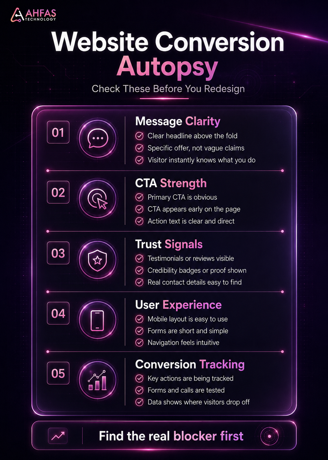
Use this checklist before redesigning your website.
Message Clarity
- Does the homepage explain what you do within five seconds?
- Is the main benefit clear?
- Is your offer specific?
- Does the page speak to the customer’s problem?
- Is the headline stronger than a generic slogan?
CTA Strength
- Is the main CTA visible above the fold?
- Does the CTA explain the next step?
- Is there a CTA after important sections?
- Is the CTA easy to tap on mobile?
- Are phone and WhatsApp options easy to find?
Trust Signals
- Are reviews or testimonials visible?
- Is your business address clear?
- Is your phone number easy to find?
- Do you show portfolio or examples?
- Is your process explained?
- Do you answer common objections?
User Experience
- Is the website fast on mobile?
- Is the navigation simple?
- Are forms short?
- Is text easy to read?
- Are images optimized?
- Does every section have a purpose?
Conversion Tracking
- Are form submissions tracked?
- Are phone clicks tracked?
- Are WhatsApp clicks tracked?
- Are booking clicks tracked?
- Are thank-you pages set up?
- Are key events tracked in analytics?
When to Get Professional Help
Get professional help if your website looks good but still has:
- traffic with no leads
- service pages with no inquiries
- paid ads with weak results
- high bounce rate
- low form submissions
- poor mobile conversions
- slow loading pages
- confusing user journey
- weak CTAs
- unclear copy
- no conversion tracking
AHFAS Technology can help with conversion-focused website development, content strategy help, professional SEO support, and connected digital marketing services that support visibility, trust, and qualified inquiries.
The goal is not to make the website busier. The goal is to make the next step easier, clearer, and more convincing.
Your website may not need more traffic first.
It may need clearer service pages, stronger proof, better CTAs, faster loading, and a reason for visitors to trust you.
Before spending more on ads, redesign, or random marketing, request a digital gap review with AHFAS Technology and fix the right thing first.
Conclusion
A website can look beautiful and still fail if visitors do not understand the offer, trust the business, or know what to do next.
The issue is not always traffic.
It is not always design.
It is not always SEO.
Sometimes the real problem is the gap between the visitor’s question and your website’s answer.
If your website looks good but not converting, start with diagnosis. Check clarity, trust, CTA strength, mobile experience, page speed, forms, service-page content, user journey, and conversion tracking.
Good design gets attention.
Clear strategy turns attention into action.
FAQs
1. Why does my website look good but not convert?
Your website may look good but fail to convert because the message is unclear, the CTA is weak, trust signals are missing, forms create friction, mobile usability is poor, or visitors do not see enough reason to contact or buy.
2. Can a beautiful website still have a low conversion rate?
Yes. Visual design can make a website look professional, but conversions depend on clarity, relevance, trust, user experience, speed, and a strong next step.
3. How do I know if my website has a conversion problem?
Check Google Analytics 4, form submissions, phone clicks, WhatsApp clicks, bounce behavior, scroll depth, heatmaps, session recordings, and service page performance. If users visit but do not act, you likely have a conversion issue.
4. What is the biggest reason websites do not convert?
One of the biggest reasons is unclear value. If visitors do not quickly understand what you offer, why it matters, and what to do next, they usually leave.
5. Should I redesign my website if it is not converting?
Not always. Sometimes you need better copy, stronger CTAs, trust signals, faster loading, simpler forms, or improved mobile UX. A redesign is needed when the structure, user journey, or technical foundation is weak.
6. How can I improve my website conversion rate?
Start by clarifying your headline, improving CTA placement, adding proof, simplifying forms, speeding up the site, improving mobile usability, and tracking conversions properly.
7. Do trust signals improve website conversions?
Yes. Reviews, testimonials, case studies, business details, secure forms, clear contact information, and visible proof reduce doubt and help visitors feel safer taking action.
8. Why does my website get traffic but no leads?
Your traffic may be low-intent, or your page may not match what visitors need. The website may also lack a clear offer, strong CTA, trust signals, or a simple conversion path.